11% increase in mobile self-service retention under operational collapse pressure. Redesign of Oi’s Call Interceptor to contain the explosion of Call Center demand during the pandemic peak.
The Call Interceptor is a visual contingency interface that pops up on the customer’s smartphone when they call support. The goal is to intercept the call intent and offer an immediate digital resolution path (self-service).
During lockdown, with physical stores closed and the Call Center at capacity, Marketing pushed for a brand aesthetic update (rebranding) and the inclusion of new menu options. My mission was to ensure aesthetics didn’t compromise call deflection efficiency.
Marketing wanted to implement the company’s new visual identity, and Product wanted to expand menu functions to broaden digital self-service options. All of this at the expense of the best experience and the critical need to relieve pressure on the human channel (Operations).
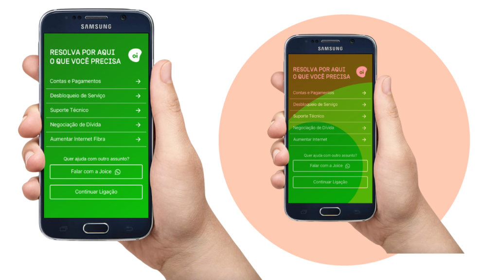
I used the rebranding as an opportunity for technical cleanup in the Information Architecture. I pushed back on horizontal menu expansion, clustering similar topics to reduce visual scanning effort.
I sacrificed button specificity and changed critical labels (like WhatsApp), accepting the risk of momentary confusion in exchange for a high-speed decision interface.
Diagnosing the Chaos: Heuristics and Psychology Laws
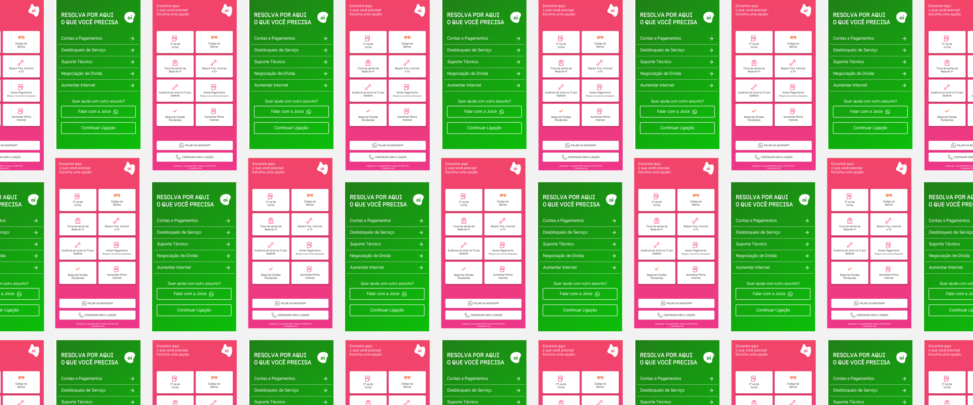
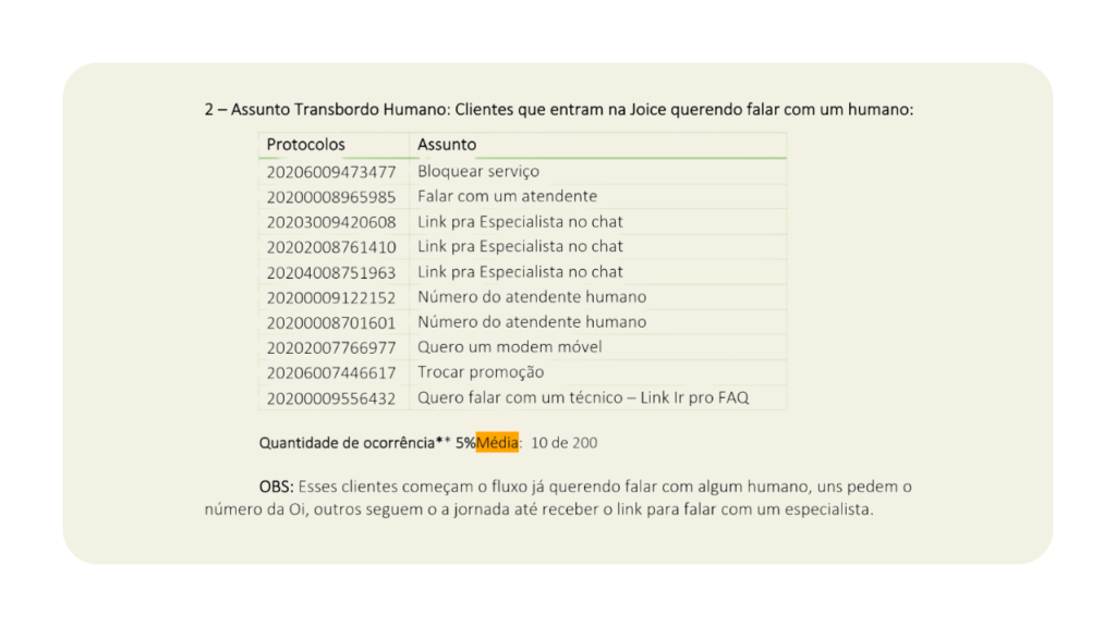
The original interface suffered from choice overload that ignored Hick’s Law (decision time increases logarithmically with the number of choices). With 10+ options in two columns and no visual hierarchy, stressed users (lockdown context) were forced into excessive memory load, violating the Recognition rather than Recall heuristic.
Taxonomy and Behavior Audit
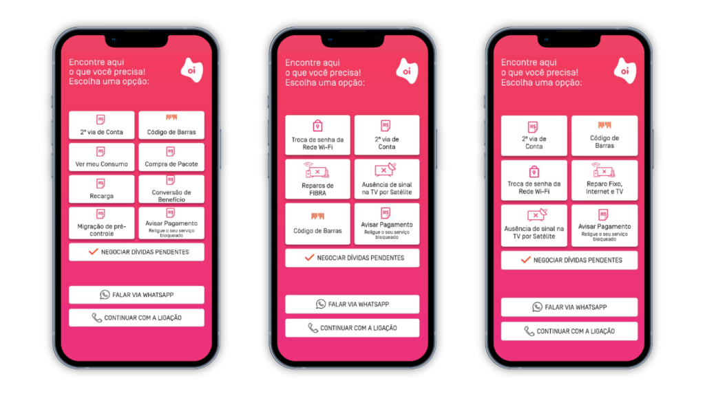
I noticed that “Bill copy” and “Barcode” were treated as separate paths and, worse, led to fragmented experiences. One required app download and the other directed to a mobile site (deprecated environment), creating friction and frustration.
Based on behavioral data from the self-service website, I identified that when searching for a “bill copy,” users actually just needed the barcode for payment.
I unified both terms into a single strategic button, directing the flow to the responsive self-service website (more stable and without download barriers), eliminating destination confusion and simplifying the information architecture.
Data-Driven Design (Impact Ranking)
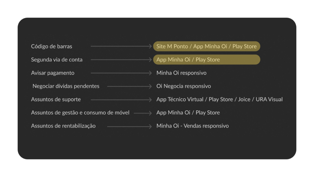
I cross-referenced Call Center contact reasons with actual Interceptor clicks (Jan-Jul 2020 data) to define priorities:
The Escape Route
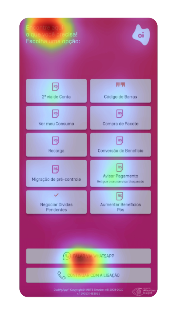
I identified that the “Chat via WhatsApp” button captured up to 42% of clicks in some segments (like TV and Fiber). This signaled that the digital channel was failing: users clicked WhatsApp as an escape hatch to try reaching a human, not by channel preference. The solution was to change the copy to “Talk to Joice,” making it explicit that the button wouldn’t lead to human support.
Low-Impact Cuts
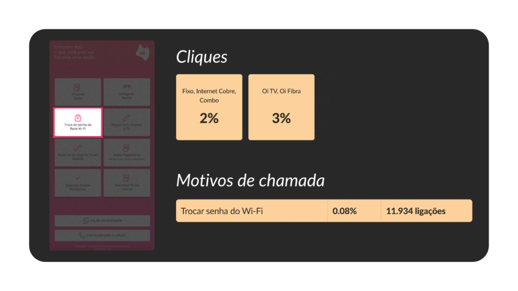
Options like “Wi-Fi Password Change” (around 2% of traffic) were removed from the main screen to give prime real estate to high-volume flows.
Solution and Results
In just 3 weeks, we shipped the new layout integrated with the rebranding. The result was +11% net retention and a 78% jump in payment clicks, relieving pressure on Oi’s financial operations.
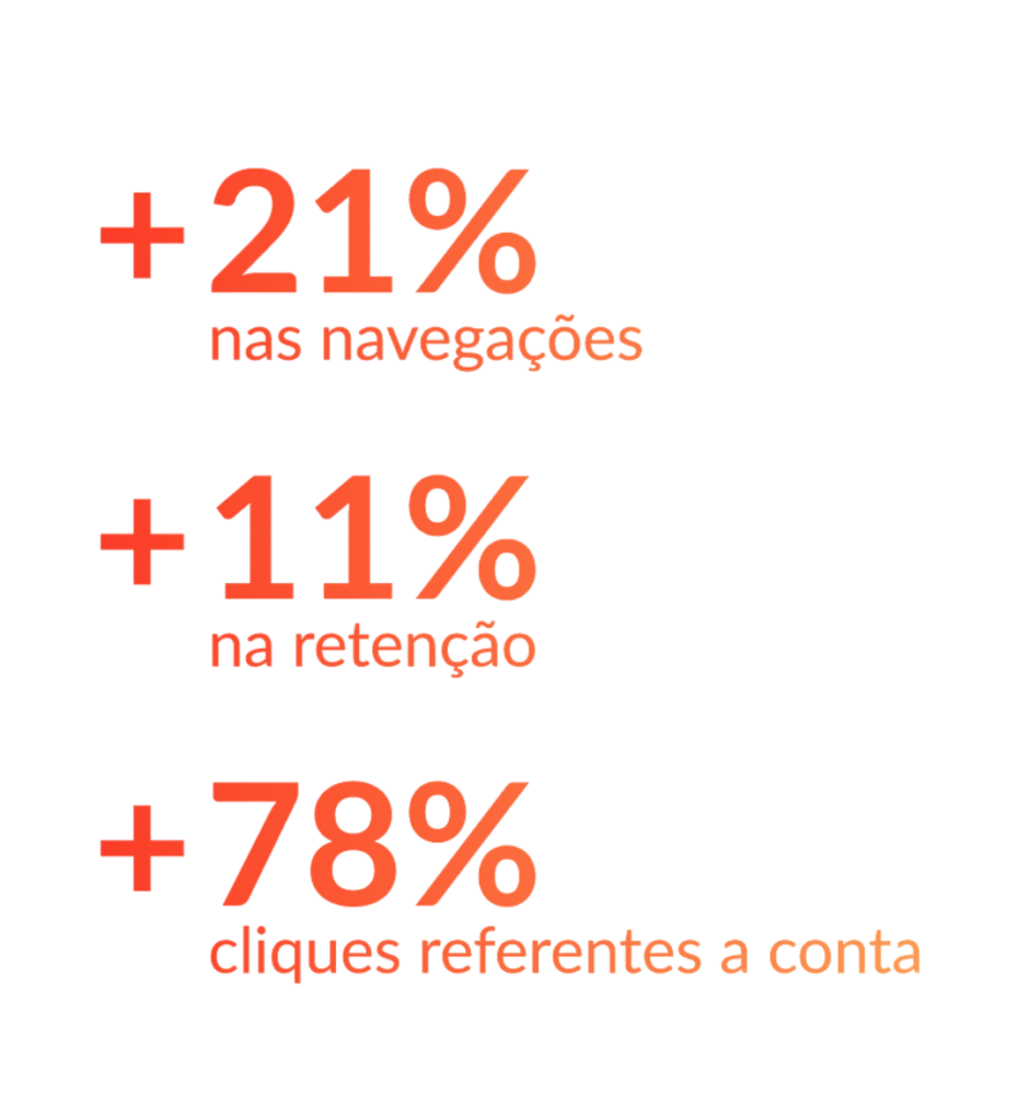
We recorded a 21% increase in internal navigation. As a senior designer, I recognize that clustering may have increased search time, but it was an accepted trade-off to ensure customers didn’t abandon digital and fall into a human queue.
Today, I would run First Click Testing to validate whether the new semantic grouping of “Bills” is intuitive across all user segments.
In the 2020 scenario, success was primarily measured through business metrics such as retention and click-through rates. However, to ensure the experience was sustainable and truly effective from a user perspective, I identified the need to introduce specific UX metrics that were not collected at the time due to urgency, such as:
- Time to first decision – Evaluate menu clarity and cognitive load by measuring the time between the intercept screen being displayed and the user selecting an option.
- Backtracking rate – Identify unclear labels or mismatched expectations by measuring how often users return to the main menu after selecting an option.
- Self-service resolution rate (originating from the interceptor) – Measure the real effectiveness of the self-service experience by tracking the percentage of users who enter the digital journey via the call interceptor and resolve their issue without human support.