02 · E-commerce · Study · 4 min read
Conversion optimization and design integrity: the Shein checkout
A forced sign-up creates abandonment, not leads. I moved the phone number request to after the purchase and fixed the usability and accessibility flaws in the sign-in: the projection is +15% sign-in success, with up to 14% of users won back.
- Problem
- A mandatory phone number sign-up interrupts the purchase and drives away people who have already decided to buy.
- What I did
- I fixed usability and accessibility flaws and moved the phone number request to after the purchase.
- Projection
- +15% sign-in success, winning back people who abandon the purchase over privacy.
Leads or conversion?
To optimize the flow, you have to manage the conflict between Marketing’s goals (SMS leads) and Product’s goals (conversion). I weighed two strategic paths:
- Option A, incremental adjustment: fix only the visual interface errors and improve how the fields are explained, without changing the data collection journey.
- Option B, design with integrity (chosen): pay off the usability and accessibility debt, make the user’s choice transparent and add a post-checkout capture.
I found that the interface already had a “Skip” option, but it didn’t work. With no clarity about why the number was being requested, people froze. I turned a “dead option” into an informed decision, reducing psychological friction.

Entry: a single field for phone or email. 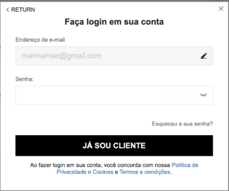
Sign-in with email and password. 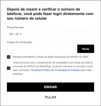
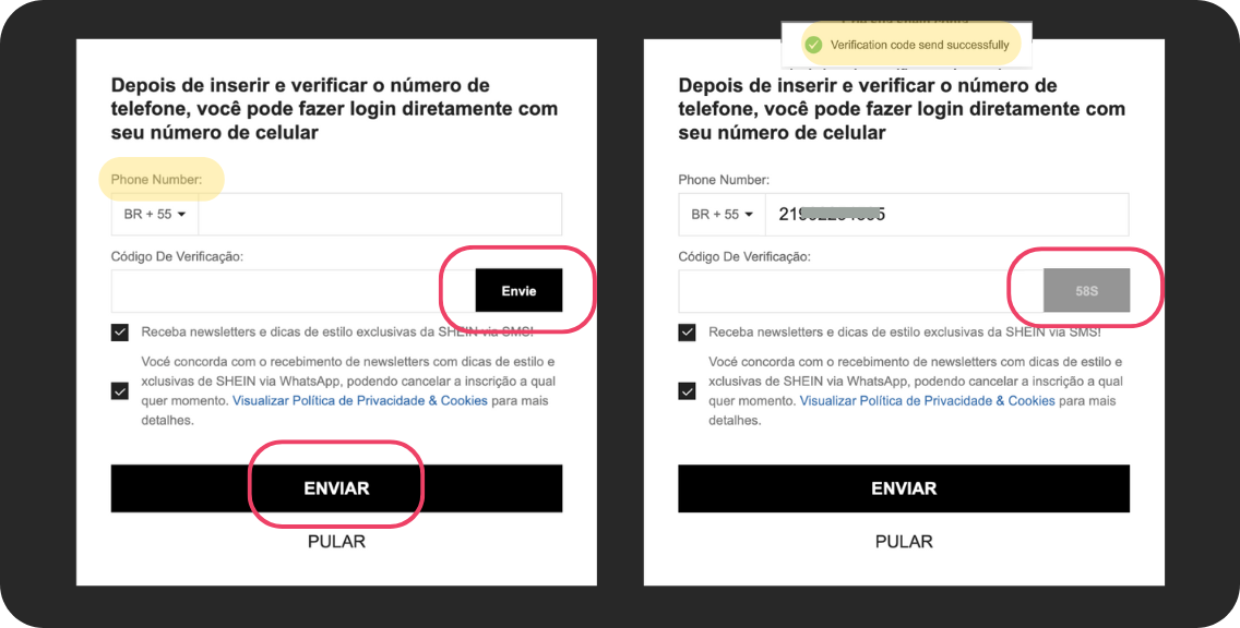
After signing in, the phone number request: SMS and WhatsApp come pre-checked, and two “Send” buttons do different things. 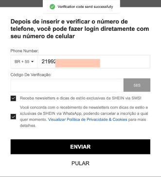
The code-sent message appears in English, in the middle of a Portuguese screen. 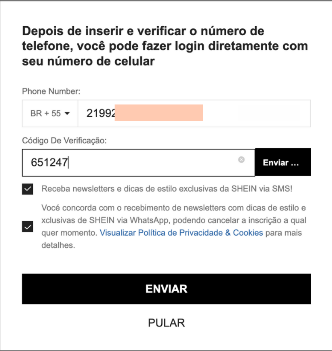
With the code typed, people have to guess which of the two “Send” buttons to use. 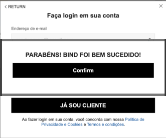
The confirmation uses technical jargon (“bind”) and mixes Portuguese and English.
I accepted a lower immediate volume of leads at the top of the funnel. My thesis is that a customer who completes a purchase today is worth more than a phone number in a lead database from someone who gave up out of frustration.
Picking the battle: why sign-in?
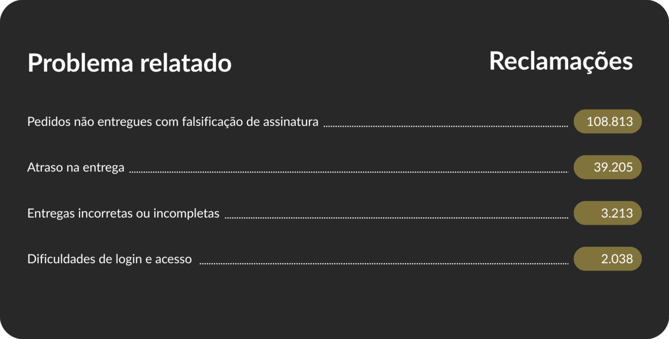
Analyzing Shein’s data on Reclame AQUI, Brazil’s largest consumer complaints website, I found deep pain points: logistics, items different from what was advertised and difficulty exchanging a purchase. I chose to focus on sign-in and sign-up friction. The reason is pragmatic: logistics depends on third parties and infrastructure; sign-in is 100% digital, quick to implement, and it is the “gatekeeper” of the sale. Fixing sign-in is the fastest way to stop the revenue loss at a low implementation cost.
Reducing cognitive load and ending technical debt
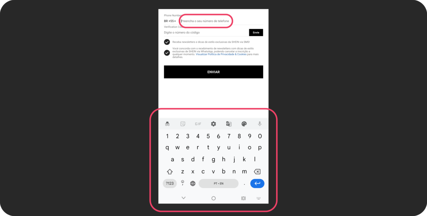
I found a critical usability flaw: nearly identical buttons (“Envie” and “Enviar”, both meaning “Send”) for different functions, violating Nielsen’s consistency heuristic [3]. On top of that, the phone field didn’t bring up the numeric keyboard and ignored Tab navigation. My proposal removes these barriers by applying WCAG guidelines [4], making input universal, fast and inclusive.
Reframing “Skip”: from uncertainty to intention
According to the Baymard Institute, 14% of users abandon checkout if they are forced to give their phone number without a clear reason [1]. The original “Skip” button failed because it didn’t explain the consequences of the choice. My solution added contextual microcopy: the phone number is presented as an optional benefit for order tracking. This removes the fear that skipping the field might affect the delivery.
The entry stays the same. So does the sign-in. 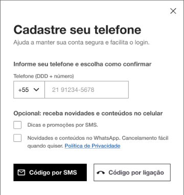
The title says why the number is requested, messages come unchecked and optional, and each button says what it does. 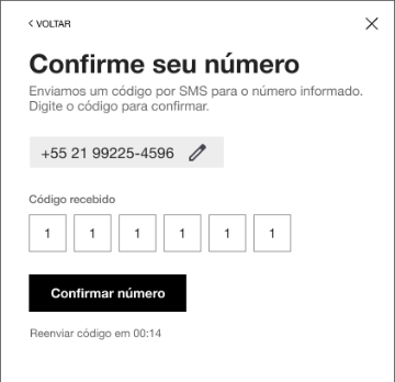
One action per screen: confirm the number, with the time to resend the code in view. 
The confirmation, in plain Portuguese, says how to edit or remove the number. 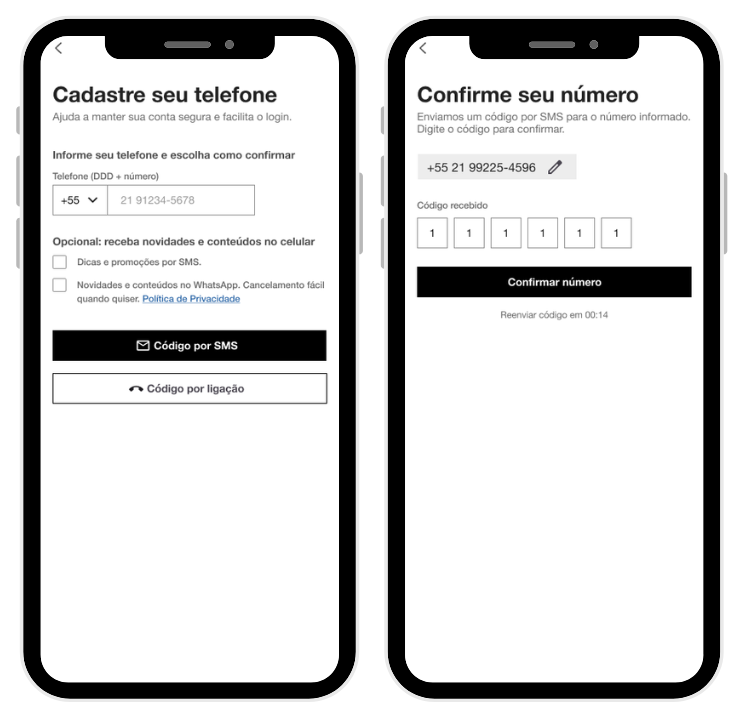
The same proposal on mobile.
The master strategy: post-checkout timing
I moved the capture to the moment of reward. By asking for the phone number on the purchase success screen, the user has already converted and has a real incentive to provide it: getting tracking updates. Reciprocity replaces interruption.


- average cart abandonment [2]
- 70.22%
- give up because of a complicated sign-up or sign-in [2]
- 18%
- projected sign-in success
- +15%
The financial impact of this decision is supported by global data from 2026. By neutralizing the rejection of the 14% of users who won’t compromise on privacy and reducing the complexity of the sign-in, the projection is a 15% increase in the sign-in success rate, recovering orders that would be lost at the start of the journey.
Conclusion
Impactful design isn’t about covering up flow problems; it’s about tackling the root cause. In Shein’s case, the focus shifted from “How do we reduce abandonment on this screen while keeping lead collection mandatory?” to “How do we make sure nothing stops people who have already decided to buy from converting?”. Ethical, data-backed, performance-focused design is what secures customer profitability in the long run.
References
- [1] Baymard Institute: Why the ‘Phone’ Field Should Be Explained (opens in a new tab). Data on the 14% of users who reject the phone field.
- [2] Baymard Institute (2026): 50 Cart Abandonment Rate Statistics (opens in a new tab). Reasons for abandonment: 19% because of a mandatory account and 18% because of a complex flow.
- [3] NNGroup: 10 Usability Heuristics (opens in a new tab). Visibility of system status (#1) and consistency (#4).
- [4] W3C (WCAG 2.1): success criterion 2.1.1 (keyboard) (opens in a new tab), full navigation with Tab; success criterion 1.3.5 (identify input purpose) (opens in a new tab), numeric keyboard for phone numbers; success criterion 1.4.1 (use of color) (opens in a new tab), error states accessible to color-blind users.