03 · E-commerce · Independent study · 4 min read
Study: the required phone number in Shein’s sign-in
Independent study, not affiliated with Shein, based on the website flow in June 2025.
I analyzed the phone number request that shows up right after signing in to Shein. I found usability and accessibility flaws, and I propose making the phone number optional and asking for it after the purchase.
- Problem
- A mandatory phone number sign-up interrupts the purchase and drives away people who have already decided to buy.
- What I did
- I analyzed the flow, listed the usability and accessibility flaws and proposed asking for the phone number after the purchase.
- Estimate
- Could win back some of the people who give up when faced with the required phone number.
What I found on the phone number screen
After sign-in, the website asks for a phone number. On that screen, I found:
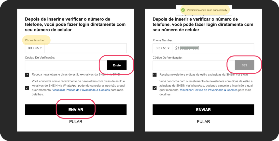
- two buttons with almost the same name: “Envie” sends the code and “Enviar” confirms it (both mean “Send”) [3];
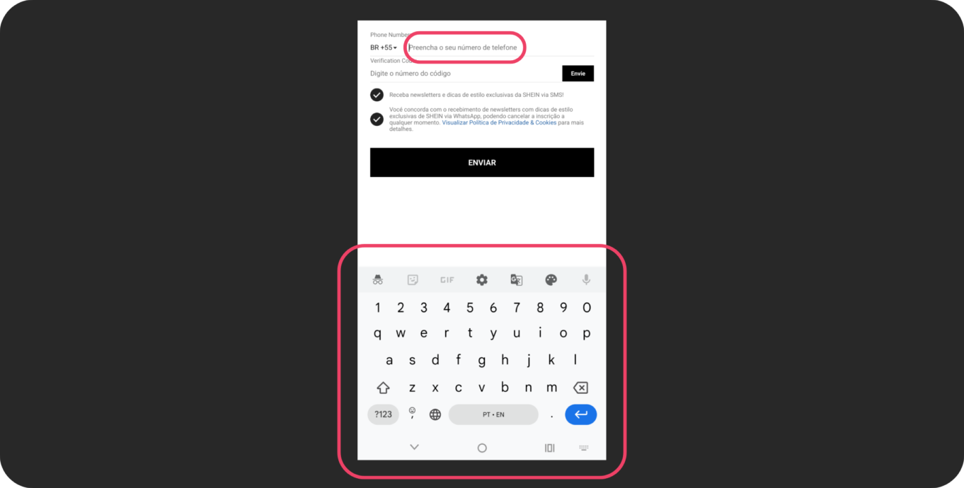
- the phone field opens the letter keyboard instead of the numeric one, and you can’t navigate with Tab [4];
- English text in the middle of a Portuguese screen, like the field label and the code-sent message;
- a confirmation with technical jargon: “Bind was successful”;
- SMS and WhatsApp come pre-checked;
- a “Skip” option that doesn’t say why the number is requested or what happens if you skip.
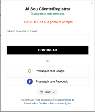
Entry: a single field for phone or email. 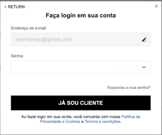
Sign-in with email and password. 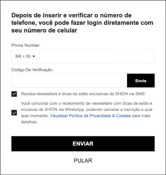
After signing in, the phone number request: SMS and WhatsApp come pre-checked, and two “Send” buttons do different things. 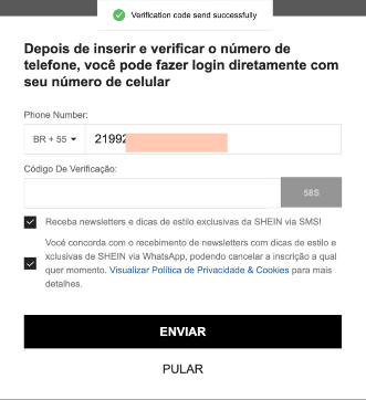
The code-sent message appears in English, in the middle of a Portuguese screen. 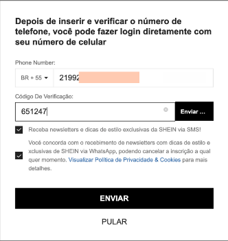
With the code typed, people have to guess which of the two “Send” buttons to use. 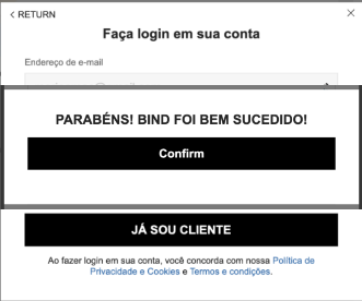
The confirmation uses technical jargon (“bind”) and mixes Portuguese and English.
Why I looked at sign-in
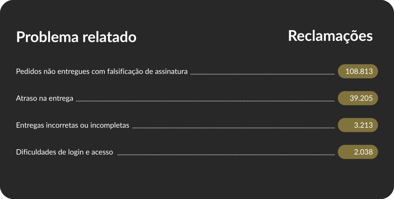
In Shein’s data on Reclame AQUI, Brazil’s largest consumer complaints website, the top complaints are about logistics, products different from what was advertised and difficulty with exchanges. I chose sign-in for a practical reason: logistics depends on third parties, while sign-in is 100% digital, quick to fix and sits at the start of every purchase.
My proposal
I propose keeping the entry screen and sign-in as they are and redoing the phone number request: the title says why the number is requested (to track the order), SMS and WhatsApp come unchecked, each button says what it does, the field opens the numeric keyboard and all the copy is in Portuguese.
The entry stays the same. So does the sign-in. 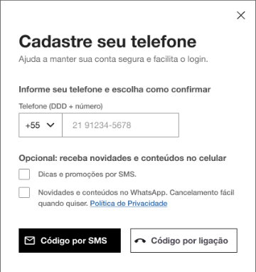
The title says why the number is requested, messages come unchecked and optional, and each button says what it does. 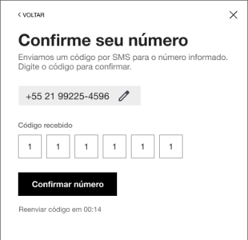
One action per screen: confirm the number, with the time to resend the code in view. 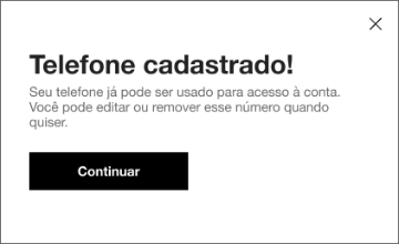
The confirmation, in plain Portuguese, says how to edit or remove the number. 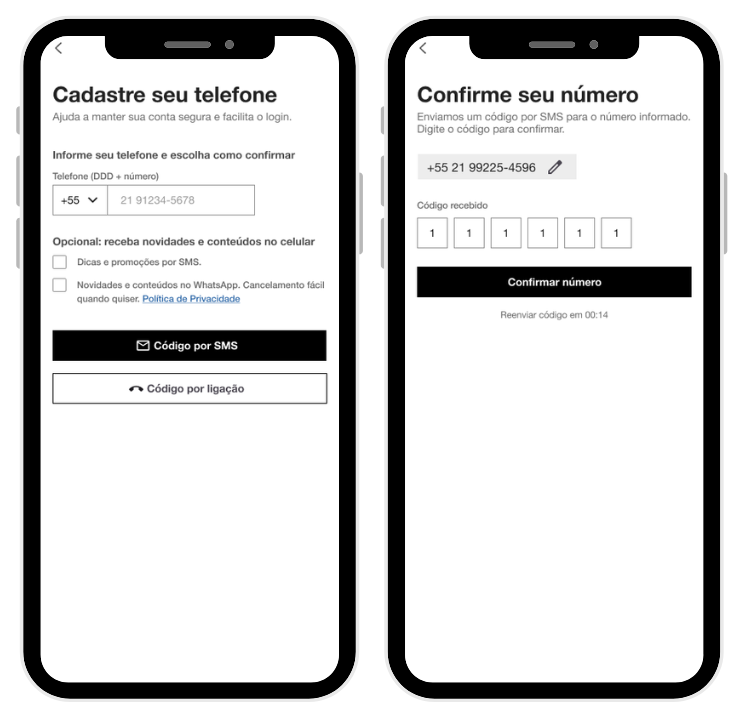
The same proposal on mobile.
What if the phone number came after the purchase?
I also propose asking for the phone number on the order-complete screen. At that point, the person has already bought and has a reason to give their number: tracking the delivery.


Leads or conversion?
I assume the required phone number serves a Marketing goal: building a list of SMS contacts. I considered two paths:
- A: only fix the interface errors and explain the fields better, without changing when the phone number is requested.
- B, what I propose: fix the errors, make it clear that the phone number is optional and ask again after the purchase.
My proposal collects fewer phone numbers up front, in exchange for not losing people who have already decided to buy.
How much this could win back
In Baymard’s research, 14% of people say they would never give their phone number to an online store [1]. With the number optional and requested after the purchase, the proposal could win back some of the people who give up at this step.
- average cart abandonment [2]
- 70.22%
- leave because the site required an account [2]
- 18%
- would never give their phone number to an online store [1]
- 14%
References
- [1] Baymard Institute: Why the ‘Phone’ Field Should Be Explained (opens in a new tab). 14% would never give their phone number to an online store (2025 data).
- [2] Baymard Institute: Cart Abandonment Rate Statistics (opens in a new tab). Reasons for abandonment: 18% because an account was required and 17% because checkout was too long or complicated.
- [3] NNGroup: 10 Usability Heuristics (opens in a new tab). Visibility of system status (#1) and consistency (#4).
- [4] W3C (WCAG 2.1): success criterion 2.1.1 (keyboard) (opens in a new tab), full navigation with Tab; success criterion 1.3.5 (identify input purpose) (opens in a new tab), numeric keyboard for phone numbers; success criterion 1.4.1 (use of color) (opens in a new tab), error states accessible to color-blind users.